Introduction: Why I Almost Launched a Broken Website
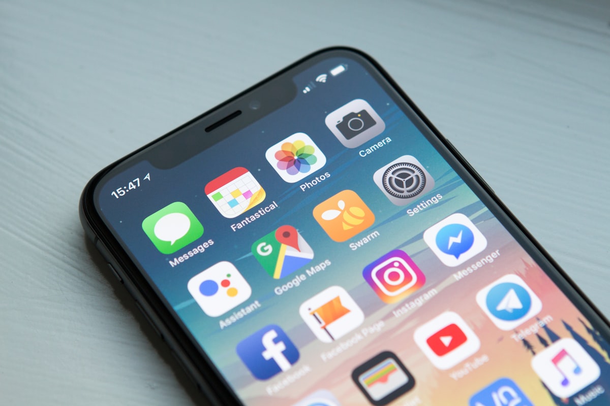
I had spent weeks building a stunning website. I opened it on my laptop and it looked perfect. Then, I opened it on my phone. It was a disaster. The buttons were tiny, the text overflowed, and the navigation was invisible. I was gutted. I had forgotten about mobile. In this guide, I'm going to teach you the "Mobile-First" approach so you never have to learn this lesson the hard way.
What is Responsive Design?
Responsive design is an approach where your website layout adapts to the screen size of the device. This is achieved using CSS media queries, fluid grids, and flexible images.
Core Concept: Mobile-First
Mobile-first means you design for the smallest screen first. You start with a single-column layout, then add media queries to enhance the layout for larger screens. This is the opposite of the old way, where designers built for desktop and tried to shrink it down. Mobile-first ensures your site is fast and usable on phones.
Real Code: Media Queries
/* Default: Mobile styles */
body { font-size: 16px; }

/* Tablet */
@media (min-width: 768px) {
    body { font-size: 18px; }
}

/* Desktop */
@media (min-width: 1024px) {
    body { font-size: 20px; }
}
Notice we use `min-width`. This means "apply these styles when the screen is at least this wide."
Step-by-Step Execution
- Open Chrome DevTools (F12).
- Click the "Toggle Device Toolbar" icon (it looks like a phone).
- Select a mobile device from the dropdown (e.g., iPhone 12).
- Now, resize your browser window. You will see how the layout adapts. Use this tool to test your own site.
Responsive Images
Images can make or break your site's speed. Use the `srcset` attribute to serve different image sizes based on the device.
<img src="small.jpg" srcset="medium.jpg 768w, large.jpg 1200w" alt="Description">Common Mistakes Beginners Make
- Hiding content on mobile: Don't just hide elements; rearrange them. If it's important on desktop, it's important on mobile.
- Using fixed widths: Avoid `width: 1200px`. Use `max-width` or percentages.
- Forgetting to test on real devices: DevTools is great, but always test on an actual phone.
Practical Exercise (Don't Skip This)
Take a simple HTML page and apply a mobile-first design. Create a 3-column layout on desktop that collapses to 1 column on mobile. If you get stuck, email me at digisoneglobal@gmail.com.
Frequently Asked Questions
Q: Should I use a CSS framework like Bootstrap?
A: It can speed things up, but it's important to learn the fundamentals first. Frameworks can add bloat.
Q: What is a "breakpoint"?
A: A breakpoint is the screen width at which you change the layout (e.g., 768px).
Tools & Resources Mentioned
- Chrome DevTools - For testing responsiveness.
- Responsively App - A dedicated tool for testing multiple screens.
- Tailwind CSS - A utility-first CSS framework.
Conclusion & Next Steps
Responsive design is not optional. Most of your visitors are on mobile. Design for them first, and you'll build a better web. Next, we'll dive into performance optimization.